A wall of paintings can feel generous and lived in, or it can make good work look scattered. The difference is rarely an expensive frame or a perfect room. It is a little planning: decide what the wall needs to say, make the group read as one shape, and give every painting enough room to be seen. Start before the first hole, and the final arrangement will feel less like decoration and more like a collection with a point of view.
1. Decide what the wall needs to do
Before choosing a layout, look at the wall from the places where you actually use the room. A wall above a sofa needs to relate to the furniture below it. A narrow hall may need a vertical rhythm that carries the eye along. A wall at the end of a passage can hold one quiet destination, while a stairwell can support movement and variation.
Ask whether the room needs one strong focal point or a more personal field of smaller works. One painting is often the calmer answer above a long sofa, mantel-free wall, or substantial sideboard. A group earns its place when several works have something to say to one another: a shared place, a family connection, a consistent light, similar frames, or simply a collection that has grown over time.
Do not begin by trying to cover every open inch. Empty wall around a group helps it register. Take a photograph from the doorway and note windows, switches, lamps, molding, and furniture. The usable wall is usually smaller than the blank wall. That is useful information, not bad news. It tells you where a group can actually breathe.
If you are still choosing the art, start with the studio’s guide to choosing a painting for your home. It helps connect scale, mood, and light before the arrangement becomes a measuring project.
2. Start with the most important painting
Every successful group needs an anchor. It may be the largest piece, the work with the darkest value, the painting with the strongest memory attached to it, or the one you want a visitor to notice first. Place that work first, even if it does not sit at the exact geometric center. The rest of the arrangement can balance around it.
Visual weight matters as much as physical size. A small, dark painting can carry more weight than a larger work with an open pale sky. A thick, dark frame can feel more substantial than a light wood frame. Step back and squint at the group on the floor. What holds your eye first? If the answer changes every second, the wall may need a clearer anchor.
When the group is tied to furniture, let the furniture define the broad territory. A common starting point is for the whole arrangement to span roughly two-thirds of the width of a sofa or console. That is a guide, not a command. The useful question is whether the furniture and art read as one composition rather than two unrelated objects.
For an original painting that deserves to lead the room, a single work can be the more generous choice. The studio’s large landscape paintings and original landscape collection are useful places to explore when the wall wants one clear horizon instead of a crowd.
3. Choose a layout that suits the paintings
A grid is the quietest option. It works best when the frames are the same size, or close enough that the repeated edges create order. Grids are especially good for a series of related small works, photographs, or prints. They give the eye a reliable rhythm and can make a modest collection feel more present.
A symmetrical arrangement works when the wall, furniture, or architecture already has a center line. Two paintings above a console, a pair of vertical works beside a window, or a larger painting with smaller pieces balanced at either side can feel settled without becoming stiff. Symmetry does not mean every detail must match. It means the visual weight on either side feels comparable.
An asymmetrical arrangement is more forgiving for a collection that has grown naturally. Start with the anchor, then build outward by balancing size, darkness, frame weight, and empty space. Keep the outer edges contained within an imagined rectangle or oval. Without that broad boundary, a loose grouping can become a string of isolated objects instead of a single wall composition.
Useful home-design guides from Martha Stewart and Blick Art Materials make the same practical point: choose the structure before hanging, then let the individual works live inside it. Their examples favor grids for matching work, symmetry for a centered focal point, and more relaxed arrangements for mixed sizes and frames.
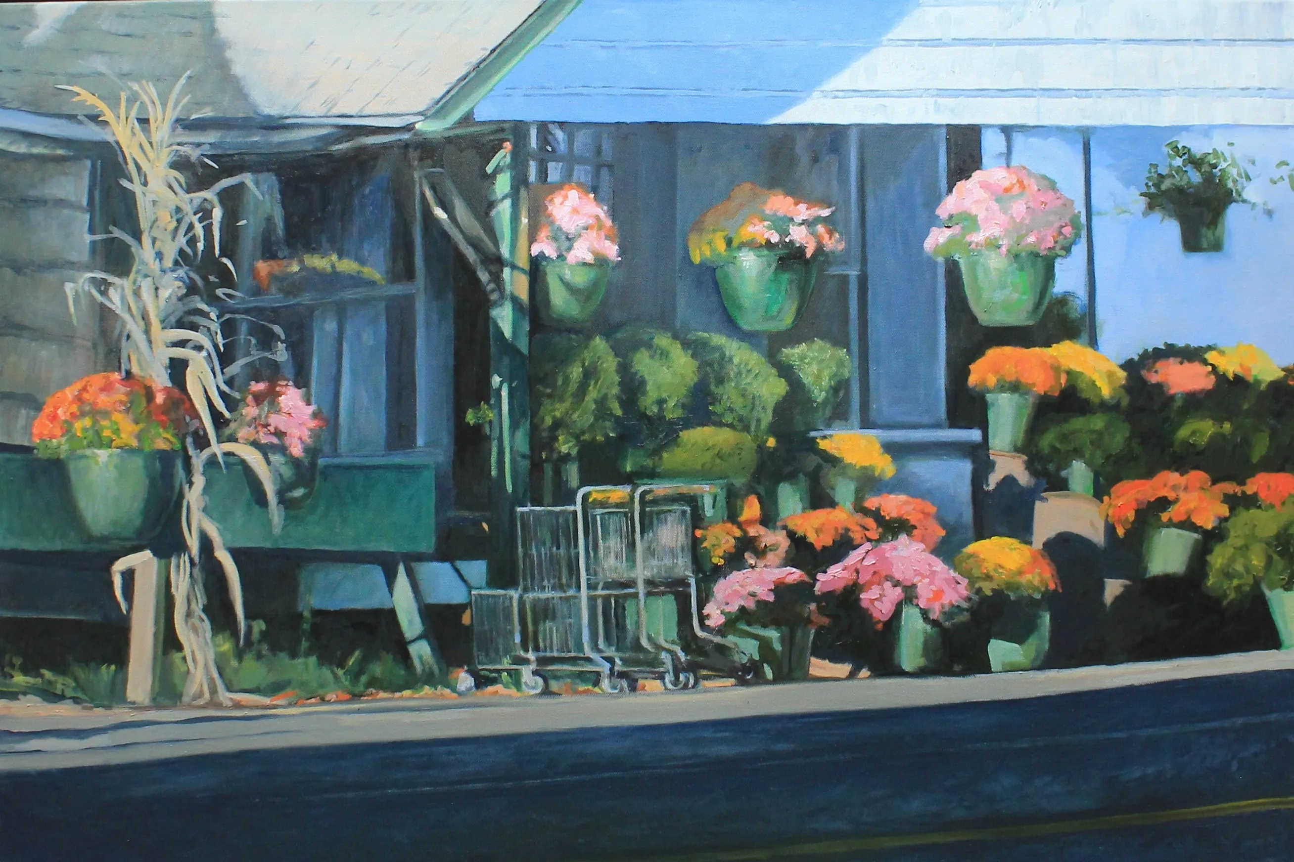
4. Make spacing consistent before making it perfect
Spacing is what lets separate paintings become a group. For most home arrangements, a gap of about 2 to 4 inches between frame edges is a practical starting point. A tighter gap makes a collection read as one denser shape. A wider gap gives each piece more independence, but too much space can make the wall feel as though the paintings were placed one at a time with no conversation between them.
Choose a gap, then use it consistently. Measure from the edge of one frame to the edge of the next, not from the centers. Centers become unreliable as soon as the paintings or frames have different dimensions. If one gap must change because of a small frame or an architectural interruption, make that choice look intentional rather than accidental.
Watch for empty channels that run all the way through a loose arrangement. A long unbroken vertical or horizontal gap can split a gallery wall into two unrelated halves. Shift one work slightly, tighten an interval, or extend the outer shape so the eye can move through the group. This is a small adjustment with a large effect.
Paper templates make this much easier. Trace each framed work on kraft paper or plain paper, mark the actual hanging point on each template, and tape the shapes to the wall. The Blick gallery-wall guide recommends living with the paper layout briefly before installation. That pause lets you see the arrangement in daylight, from the doorway, and from the main seat without turning the wall into a record of near misses.
5. Treat the whole group as one painting
Once you have the paper layout, stop judging each frame separately. Stand back and look at the group as one large shape. Where is its visual center? Does the group feel too high, too narrow, or overly stretched? Does the outer edge relate to the sofa, table, headboard, or architectural opening nearby?
On an open wall, a useful starting point is to place the visual center of the whole group near a comfortable eye level, often around 57 to 60 inches from the floor. Above furniture, the furniture becomes the anchor. Let the bottom of the group sit close enough to the furniture that they belong together, while leaving enough room for frames and objects below to breathe. The studio’s guide to hanging a painting explains how to find that relationship and measure the actual hook position rather than guessing from the top of the frame.
Check the view while seated as well as standing. A wall in a living room is often experienced from a sofa, not from the middle of the floor with a tape measure in hand. A group that looks correct standing up can feel strangely high from the chair where the room is actually used.
Do not force a group to solve a scale problem that really calls for a larger work. If several small paintings still look lost against a long sofa, the room may want a broad landscape or a different wall. The studio’s small original oil paintings are beautiful in close-viewing spaces, shelves, and narrow walls. A main wall may need a painting with more physical presence.
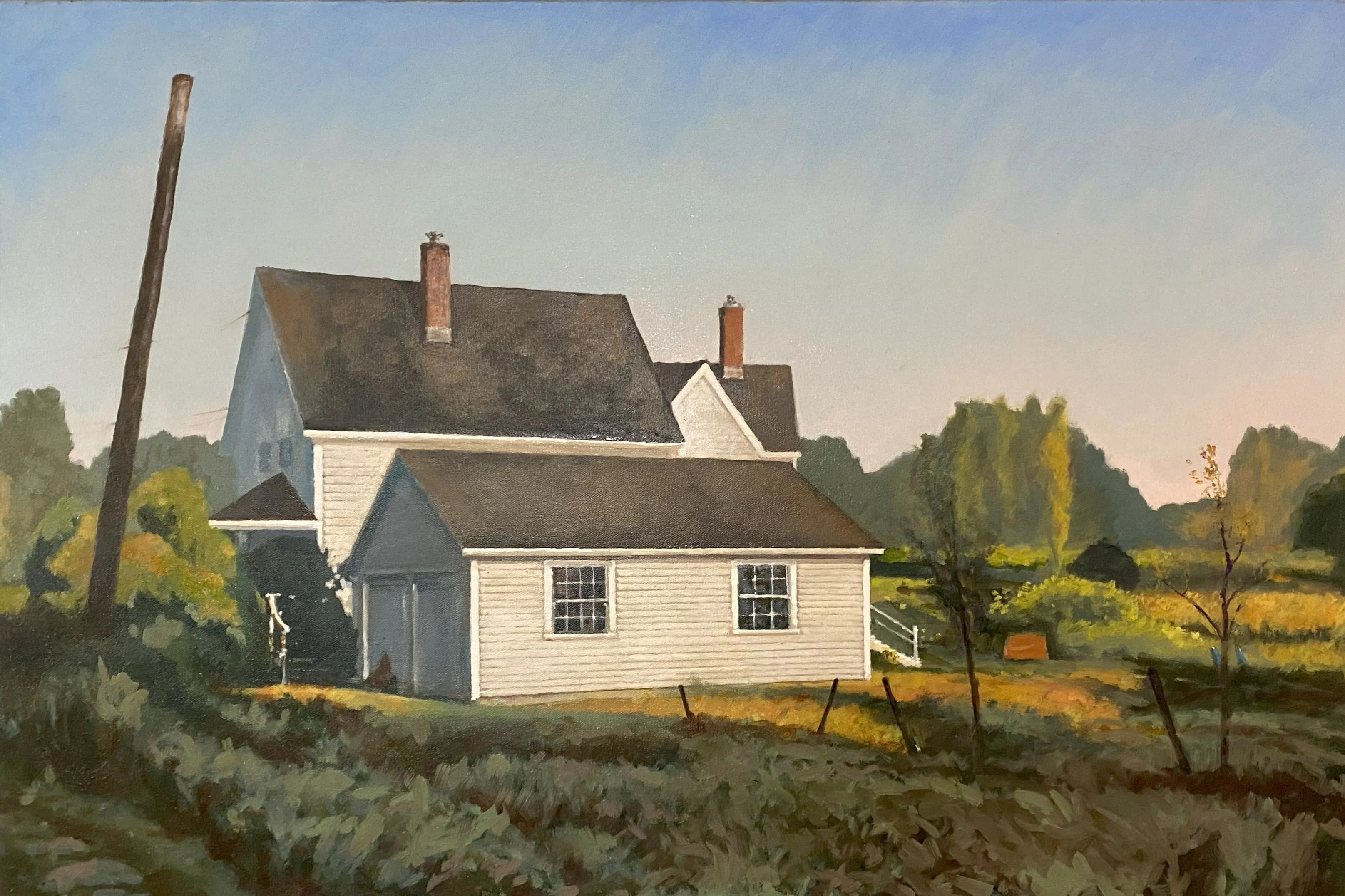
6. Let frames and color create a conversation
Matching frames are one way to make a group coherent, but they are not the only way. A collection can be held together by a repeated color, landscape subject, shared horizon line, similar paper tone, or an evolving family story. The aim is not uniformity. It is enough connection that the differences look chosen.
For a mixed group, distribute similar visual weights instead of clustering them all in one corner. If two paintings have dark frames, separate them. If one painting carries a vivid patch of red or a particularly bright sky, give it room so it does not compete with another work of equal intensity. Step back and look for balance rather than perfect bilateral symmetry.
Original art can be the work that gives a mixed wall its center. A painting has surface, scale, and visual depth that can anchor surrounding photographs or prints without making them less meaningful. Choose the original because you want to live with it, not because it is expected to rescue the whole arrangement. The strongest walls build outward from work that already matters.
Keep care in view while you arrange. Avoid direct sunlight, active heat, smoke, and walls with dramatic changes in temperature or humidity. The Smithsonian’s painting-care guidance is a useful baseline for protecting original work in a real home. The studio’s lighting guide can help you avoid glare after dark, when a carefully balanced wall should still be easy to enjoy.
7. Hang carefully, then make the final adjustments
Start with the anchor piece and work outward. Use hardware rated for the actual framed weight and the wall material. A substantial painting deserves more than a small nail and optimism. Two points of support can help a wide frame stay level and reduce the chance that the work shifts when a door closes or someone brushes past it.
Remove each paper template only as you install the corresponding painting. Use a level, then step back after every few pieces. Small spacing differences become much more visible when the final frame is up. If something feels off, adjust it before moving to the next part of the wall. A short pause during installation is easier than learning to ignore a crooked group for years.
When the wall is complete, look at it in daylight and evening light. See it from the doorway, the main seat, and the nearby passage. The goal is not to make the arrangement feel frozen. A good collection can grow. Leave space for a future work, or let the group remain finished for a while. Both are better than adding something only because an empty inch makes you nervous.
Arranging paintings from the studio
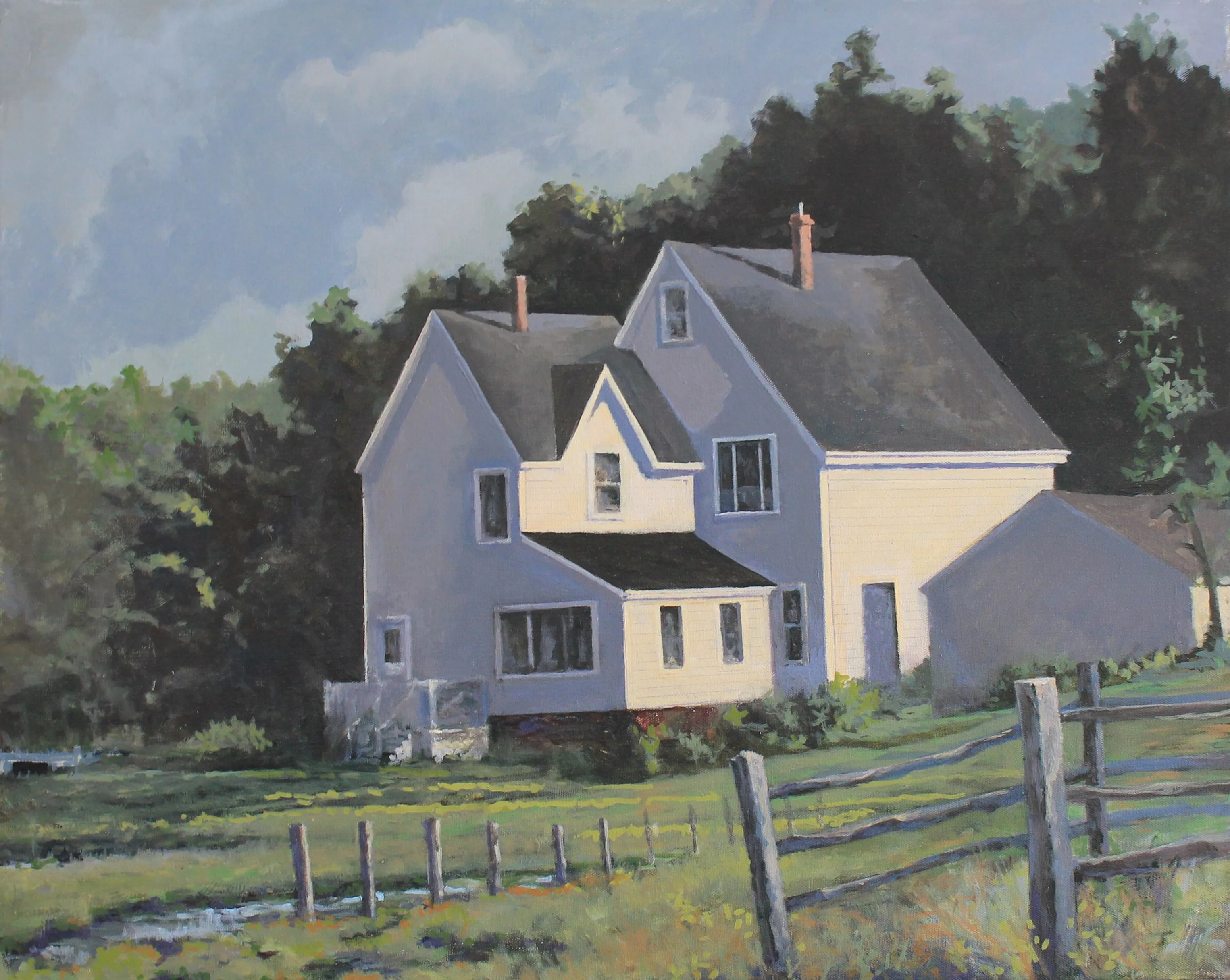
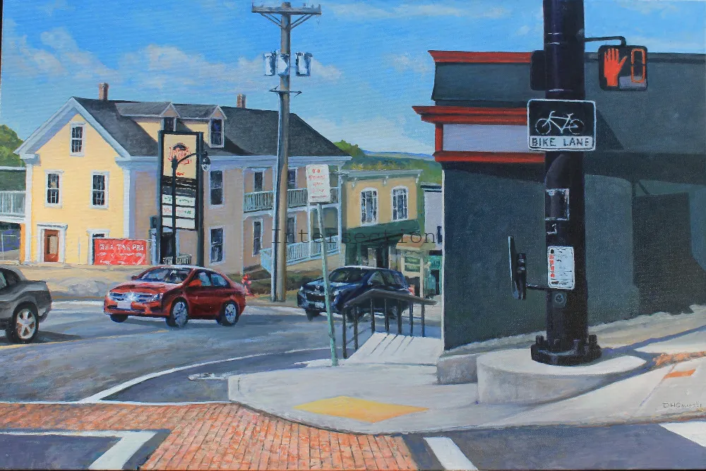
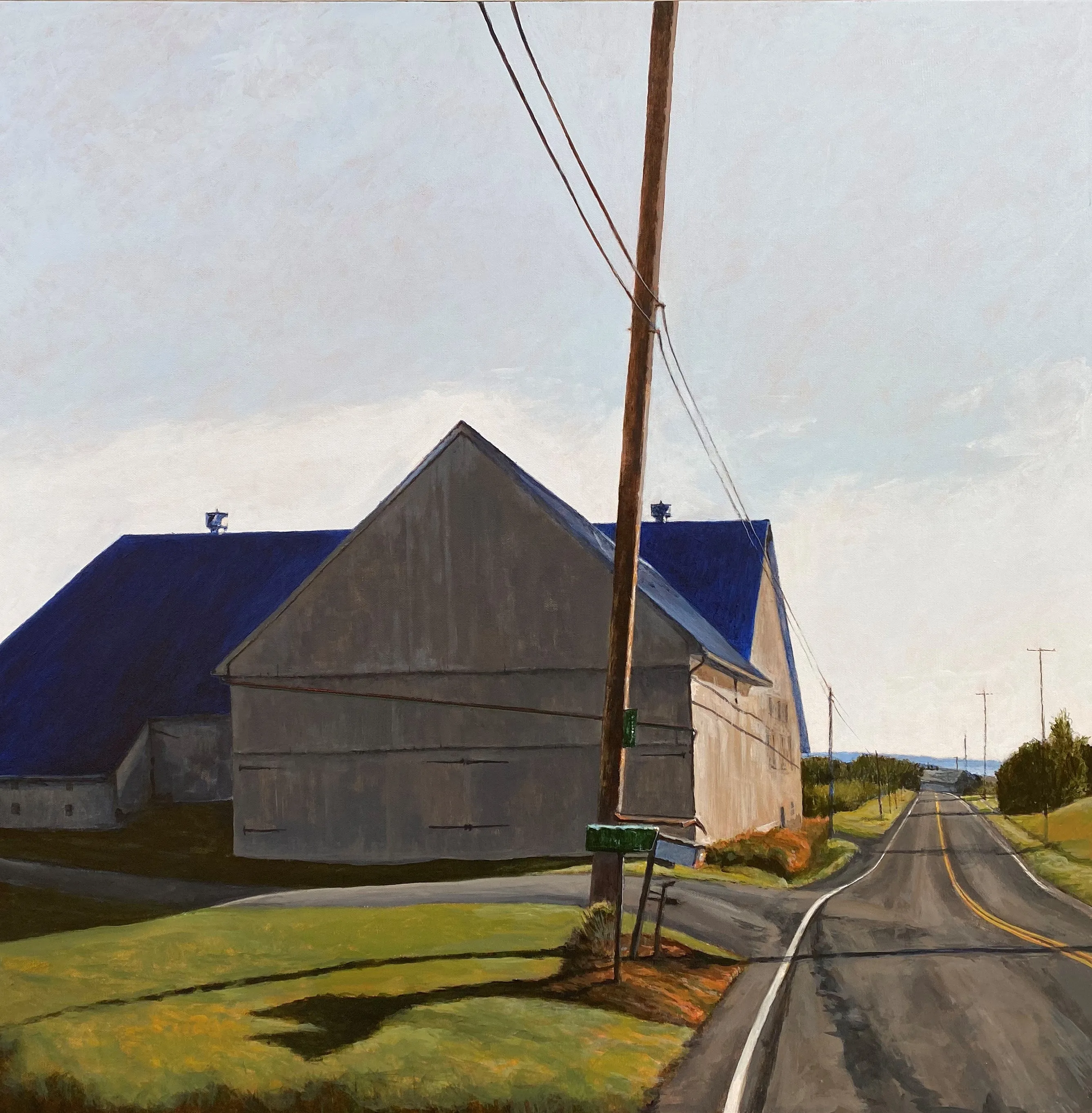
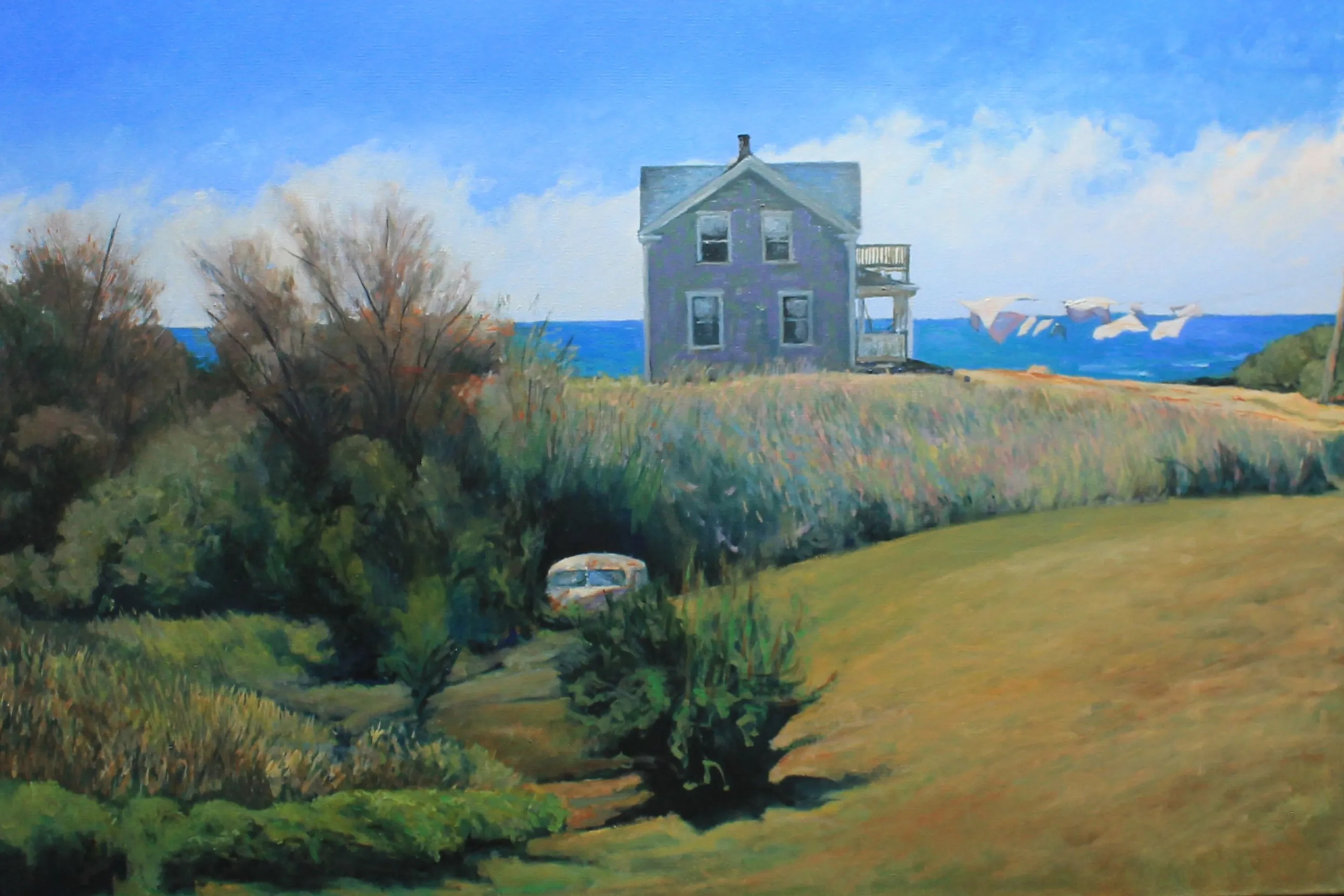
Doug Caves’s paintings of New England roads, shorelines, houses, and changing weather can work as a single focal point or as part of a more personal wall. Their sense of place gives a room a visual destination without requiring every surrounding object to match.
Browse the available paintings for current originals and signed editions. For help comparing framed dimensions, selecting a work for a particular wall, or planning a group around a painting you already own, contact the studio with a room photograph and measurements. A little planning before the first hook gives every painting a better chance to be seen.
Frequently asked questions
How much space should I leave between paintings?
For most groups, a consistent gap of about 2 to 4 inches gives each frame room while allowing the group to read as one composition. Tighter spacing creates a denser, more collected feeling. The important part is consistency: measure from frame edge to frame edge, not from the centers.
How high should a group of paintings hang?
Treat the entire group as one composition. On an open wall, begin with the visual center near a comfortable eye level, often around 57 to 60 inches from the floor. Above furniture, let the group relate to the furniture beneath it rather than forcing that number.
Should paintings in a group have matching frames?
They do not need matching frames, but the group benefits from a shared element: a related palette, similar frame tone, a repeated subject, or a common sense of scale. A deliberate mix is more persuasive than a collection that feels accidental.
Can I arrange original paintings with photographs and prints?
Yes. A mixed wall can feel personal and layered when the pieces have a clear relationship. Start with the original or most meaningful work, then use compatible color, frame finish, or subject matter to build outward. Keep the original work safely framed and securely hung.